Branding for
Cool Software
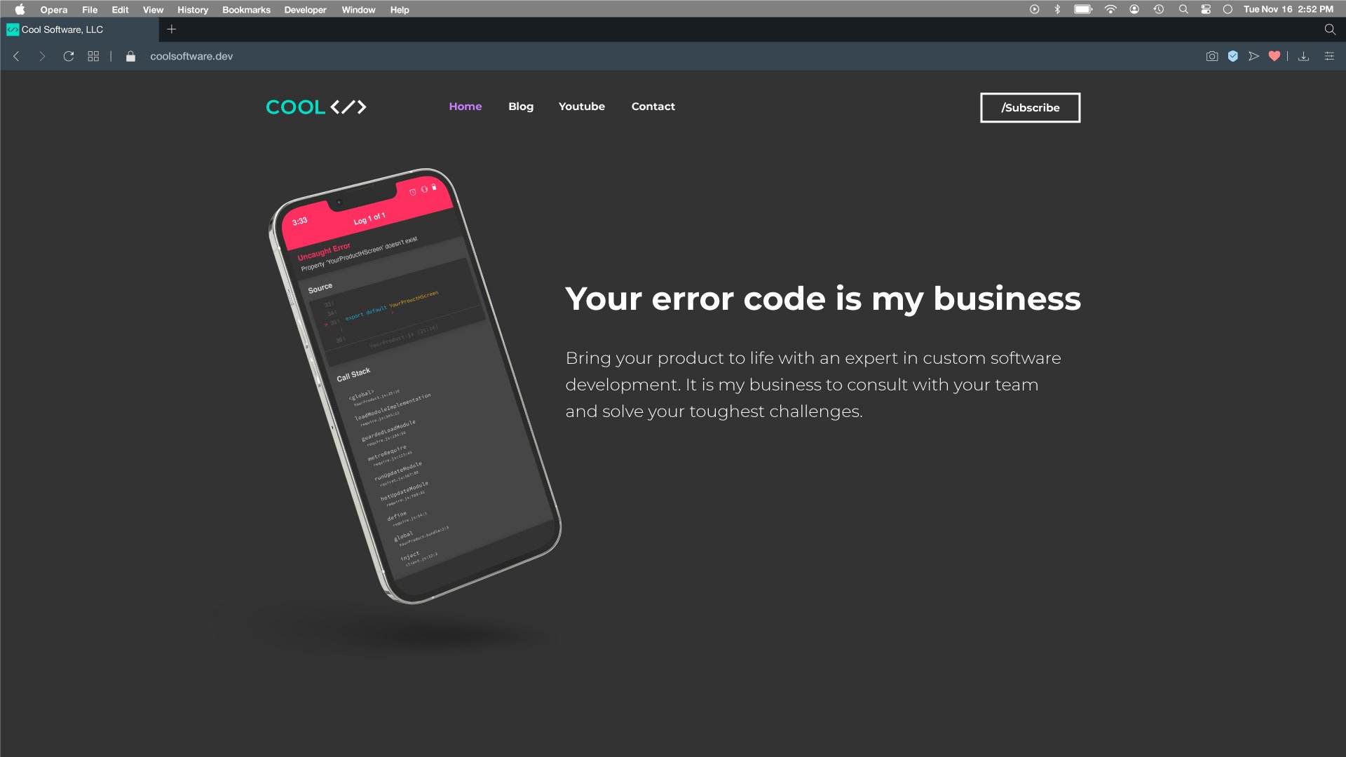
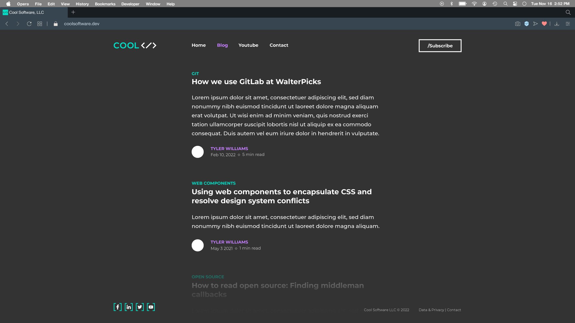
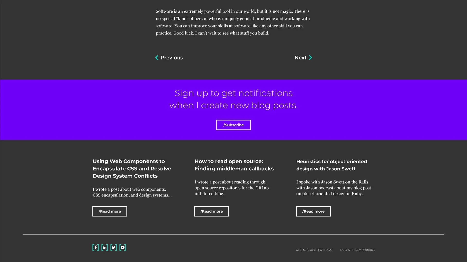
I partnered with Cool Software to create a standout brand that spoke to their position in the software development industry.
Wordmark/Logo
The Cool software logo was created as a digital first animated mark which has five distinct states that represent different forms of software, from code to compact disc to floppy disc and back to code.
The wordmark and associated logo are used to display the depth of knowledge about software languages and the ability to help solve a very diverse set of customer challenges.

Color Palette
The Cool Software palette is an interpretation of on screen code throughout the history of computers and software.
The primary colors of vibrant green and warm dark grey are reminiscent of the text seen on computers of the late 1980’s and early 1990’s
The secondary palette consisting of violets and blues represents more modern text editors and code bases.

Typography
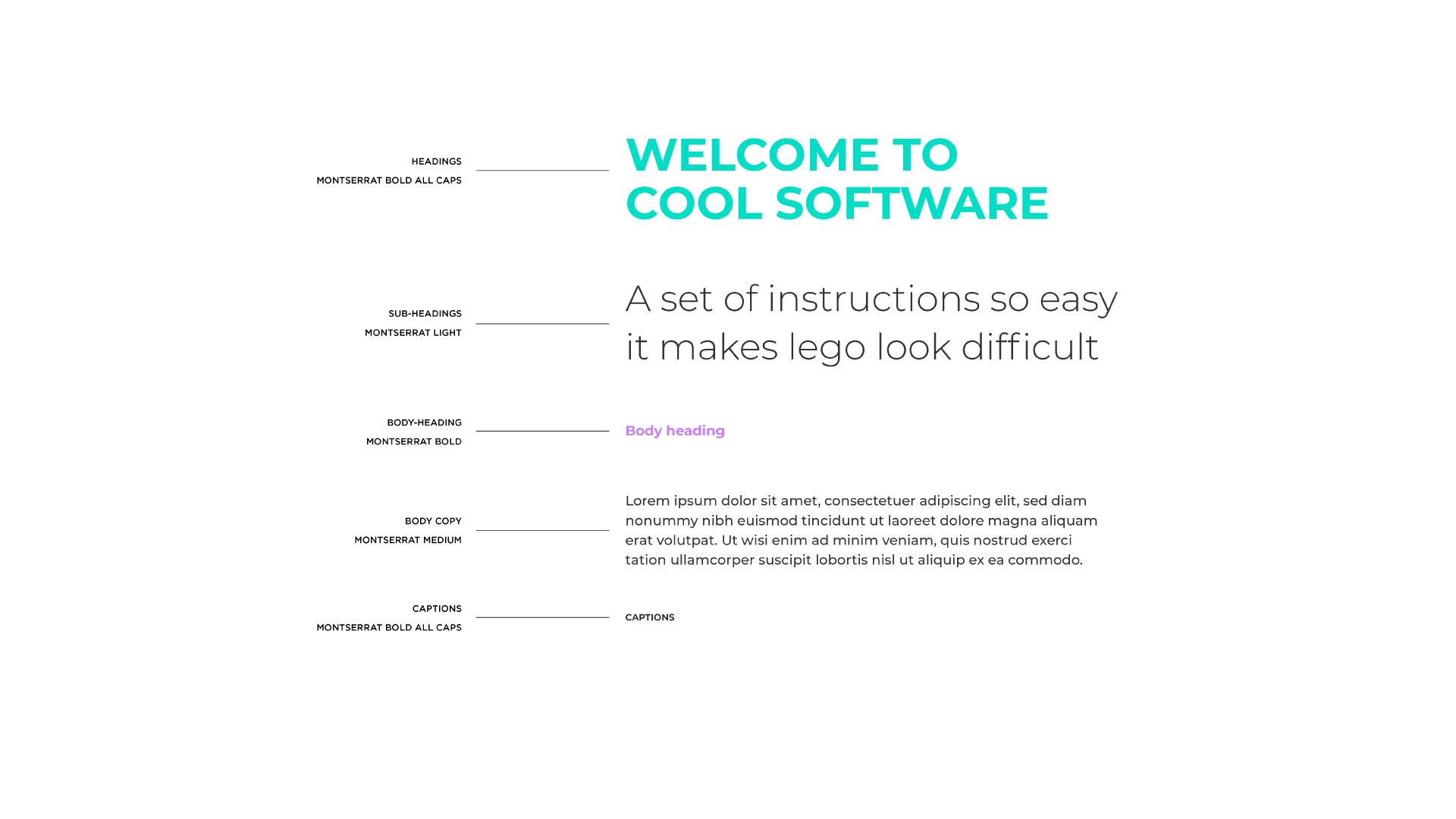
Cool software typography relys on one typeface for visual design. Montserrat, an open source google font with variable weights.
This font was chosen as a reflection of the value that Cool Software brings to the client and their unique challenges.
